What makes a good logo?

The quintessential logo bears the burden of encompassing a brand’s identity. As one of the integral brand elements, a logo reflects your brand’s emotions to the customer. It is, therefore, crucial to understand the skill, art and science that goes into coming up with the perfect logo. You could say that the statements made above are exaggerations but if you consider the integral nature of a logo to a company’s identity, you would have to reconsider.
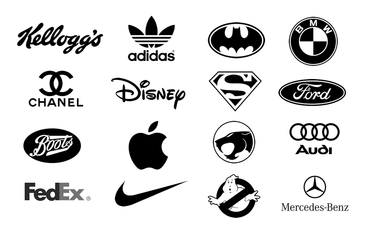
Think about FedEx, Coca Cola, Google, Chanel – these brands are known for their iconic logos. So, what makes them stand out? Let’s look at some of the significant factors that contribute to creating the ideal logo.
1. Opt for an analogous color palette
The concept of an analogous color palette, and its relevance to logo design is best illustrated with an example. Take any famous logo and pay attention to the colors used. The BP logo brilliantly combines the analogous colors green and yellow. The apparent emphasis is combining colors that create harmonious visuals. That is the very definition of an analogous color palette – colors that are in close proximity to the color wheel.
2. Shock and awe with colors
If it suits your company’s ethos, you can also choose to shock and awe with the colors that make up your logo. The emphasis here is on putting the spotlight on your brand, on grabbing consumer attention – and the best way to do this is by opting for complementary colors. These colors are placed opposite each other on the color wheel. An excellent example of this is the Heineken logo that combines a trio of colors, two of which oppose each other on the color wheel – green and red, encompassed within a white background.
3. The right typography
A logo is a window through which the consumer catches a glimpse of what your business has to offer. Its purpose doesn’t just end there; it must relay enough of your commercial story to pull your target consumer in, and for that, you must rely on the right typography. The right typography for your logo is defined by readability, so even while you are hard at work on a logo maker – combining art and skill to come with the right logo, do not undervalue readability concerning typography.
Do consider the advantages of using web-friendly fonts, as your business requires representation, both online and offline. Excellent examples of fonts that come with a high readability factor are San Serif, League Spartan, Playfair Design, and Montserrat. If you wish to go against the grain and settle for brush or handwritten script font, ensure that downsizing your logo does not impact readability.
4. Finding balance in white spaces
When using a logo creator to make your own logo that perfectly relays your brand story, consider the essential white template to incorporate the color white into your logo, and to create a neutral background that allows the other colors to pop. Starbucks, Burger King, Subway, and Arby’s are all classic examples of logos that effectively use the color white incorporated into and encompassing their logos. White balances out the combination of colors in your logo; each color stands out – yet the risk of colors that are closely placed on the color wheel blending in with each other is eliminated.
5. Alignment is the essence of a great logo
When using online logo generator tools to achieve that ideal logo design, your emphasis should be on harmonizing all elements of your creation. Perfect alignment is the key to finding harmony in logo design — the spacing of letters and words, margins, lines and squiggles, dots, and circles; every element of your logo requires careful alignment. Harmony is defined by alignment – and alignment is the essence of effective logo design.
While the design tips listed above are defining factors for excellent logo design, they do not take away from the principles of contrast, hierarchy, repetition, dominance, and balance that guide logo design. Alignment serves the need for balance in logo design. Analogous or complimentary color usage meets the need for repetition in design elements that lends so many famous logos their associative familiarity. Not only this, it also accounts for requisite contrasting elements in logo design. The right typography combined with color use aligns with the hierarchy aspect among visual elements that convey your brand identity.
As such, creating the perfect logo depends on your ability and willingness to use the above design tips in conjunction with integral logo design principles. Put a combination of these design tips and the guiding principles of logo design into practice and you can stay assured of a logo that truly encompasses your company’s identity.