This Algorithm Wants to Design Your Company Logo

I stumbled across this project called Mark Maker this evening and it piqued my interest. The project is built and maintained by Emblemmatic and its goal is to use algorithms to create logos for companies. I know what you’re already thinking: phooey!
But I had to try it out for myself.
I should note that according to the Mark Maker About page, the project is still in prototype.
Mark Maker is a prototype. It generates logos and refines them based on your feedback. As you use it, the system tries to learn what you like, and over many sessions, it attempts to understand the visual vernacular associated with logos for different kinds of companies.
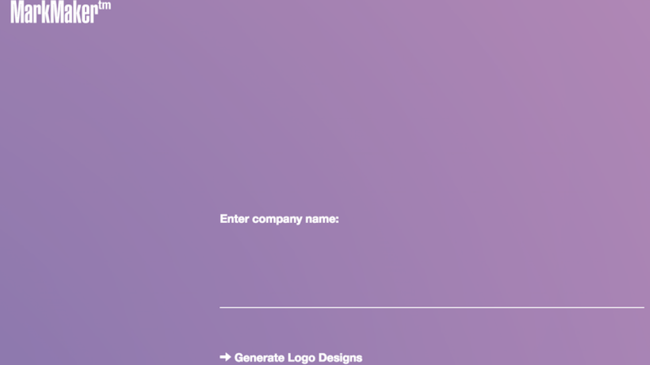
So here’s how it works: you go to the website, put in the name of your company, and the algorithm randomly produces a handful of potential designs, using a variety of fonts, colors, styles, and symbols. As you scroll through the near-endless possibilities and “like” the ones that tickle your fancy, the algorithm produces more logos with characteristics similar to those. After settling on one, you have the option to tweak the finer details, like the hue or letter spacing. And then you can download it–for free!
So it works, but it’s not an easy process. If anything, it’s tedious and a lot of work as seems to be indicated by the language on the about page: “the system tries to learn what you like, and over many sessions, …” emphasis added is my own. I spent approximately 15-20 minutes with it and you’ll see what I consider to be the “best designs” out of all the ones I scrolled through (and there were a lot).

So what’s my verdict? Hire a graphic designer. This algorithm may eventually create you a decent logo, but it will lack creativity and uniqueness. And frankly, I don’t think it would truly be representative of your brand — because that’s information you need to communicate prior to starting work on design, not after.
By the way, in case you didn’t know, this is what the KYA logo actually looks like (and yes we hired a designer).