I have not really used LinkedIn. In fact, I created an account today, so I could test out their new iPhone app. I saw the UI from the iTunes App Store screenshots and I was intrigued by how simple and easy to use the User Interface looked. Of course, as you all know, I think the most important aspect of an iPhone app is the User Interface, then features.
After using the app for about 15 minutes I was very pleased with how easy the app was to use, considering the actual LinkedIn website is very clunky (though the recent redesign is much more aesthetically pleasing), and for someone like me who went to LinkedIn for the first time, I found it very hard to use and to find/edit my profile.
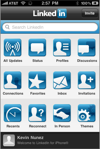
LinkedIn has 12 different icons on the home screen of the app:

As you can see, there is a great deal of pages and features right from the home screen on LinkedIn. Most iPhone apps would provide a picture-less and hard to manage list, while LinkedIn provides a sleek home screen similar to a normal page on an iPhone or iPod Touch. This makes it easier to use for iPhone/iPod Touch users, since we are used to seeing a bundle of buttons on one screen.
When you click on one of the buttons, it will take you to whatever the app says it is. The great thing about LinkedIn is that they keep the same UI throughout every single area of the app you go through. This improves load time, since the app does not need to load any new windows with a different UI, it just needs to load the content within that window. There is also a nifty black bar at the bottom of every screen, giving you two options, depending on where you are in the application. For example, if you go to “Connections” on the app, the bottom bar will show All connections or new connections to see new people you have recently added.
You know that app Bump? Well, LinkedIn has a feature similar to what Bump does. If you “bump” or go near another person who also has an iPhone/iPod Touch with Bluetooth enabled, you two can exchange LinkedIn information. This makes it easier when you are near other people and you do not really feel like going through searching hundreds of people with a similar name.

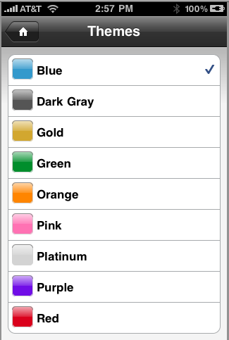
LinkedIn also has 9 great colored themes for the home page of the application, making the home screen how you like it.
LinkedIn has definitely improved the app a lot, their new app design is a good example for other social networking applications, such as MySpace, Facebook (which is the closest to LinkedIn’s new application design and probably some of the inspiration behind it), and Twitter clients to follow.
