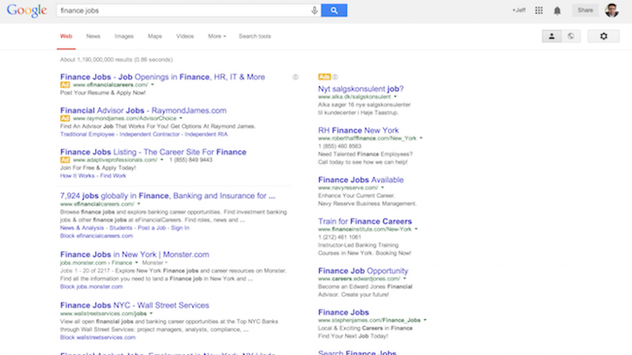
It's Not You, Google Search Results Really Do Look Different

If you have noticed that Google’s search results look a little different right now–its not your eyes playing tricks on you. The modified appearance of the results is thanks to a very large “bucket” test currently underway, which has changed the look-and-feel of Google’s list of blue links. Most notably, the search result links are no longer underlined, the fonts are larger, and ads don’t have the usual yellow-colored background, but are rather just flagged with a small yellow label that says “Ad.”
Google is constantly experimenting with its users interface, however, most of the time the tests are limited in terms of the amount of users that are thrown into the test bucket meaning often times these tests fly under the radar.
Google has pointed out that these changes were actually announced last fall for mobile users. This update, then, could be seen as a way to bridge the gap and overall difference in user experience between Google on mobile and Google on the desktop by creating a more unified experience.
As for the yellow “Ad” labels, those also were originally introduced on mobile, before being later tested on the desktop. Google notes that they have been testing these new labels for several months now. And as Google has said, right now all these changes are in the testing phase, the new search results design may end up being scrapped and never be fully rolled out to everyone. That being said, due to the large test bucket, it seems like Google is feeling pretty good about the new search results design and I would expect all Google users to see it sometime in the near future.
Update: Google has made these design changes official and live for all users.