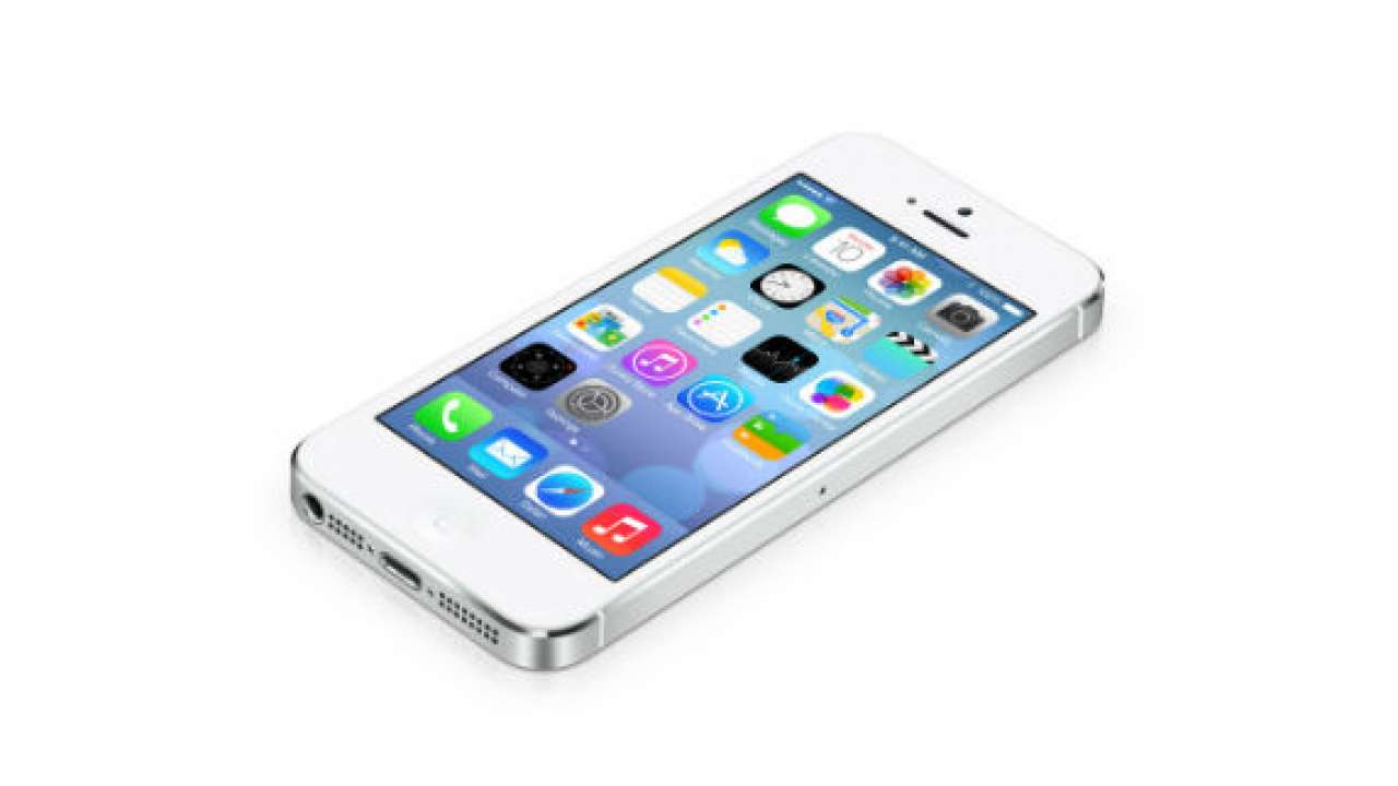
I'm still not one-hundred percent on board with iOS 7

“It just works.” It was a favorite line of late Apple CEO Steve Jobs as well as those who have reviewed the company’s recent products. Sure, iPods, iPhones and iPads aren’t boasting the deepest feature sets, but they’re designed to be easy to use. The software and hardware work in harmony. You’re able to pick up the device and, without reading an instruction manual, figure out how to use it. Or that was the idea. Then iOS 7 happened.
To be fair, the software is still in beta — beta 4 to be exact — so what we’re seeing now could change by the time the OS rolls out officially to Apple’s portable devices. And since the start of the beta process, a lot has changed. But for a company that has been all about simple products, iOS 7 is a mobile operating system that takes the far more straightforward iOS 6 and complicates it severely.
Past iOS releases have been slow and steady in terms of additions to the user interface. In iOS 5, we got Notification Center, a top-down shade that didn’t have a lot of bells and whistles. But it wasn’t complicated. In iOS 7, Notification Center can now be pulled down and swiped to reveal three different screens within it. And now there’s Control Center, which pulls up from the bottom and offers a bunch of toggles and quick access to different apps and features.
Not that these are bad additions. In fact, many iOS users, seeing all the goodies that Android’s been getting, have been clamoring for features like these. But tossing them in all at one time, along with a complete new look for the operating system, is a very un-Apple thing to do. I’m glad the company feels a little bit of heat from Android — that’s why competition is important — but when I dig deeper into the OS, I get the sense that Apple is rushing to match a bunch of Android features and slap a fresh coat of paint on iOS without taking its time to do it right.
It’s little things, like something Apple just fixed, thankfully — the lock screen. Skeumorphism is dead in iOS 7, so unlocking a phone means we don’t need something on that screen that we have to unlock. We just swipe — right? Well, Apple went through three versions of this beta with the words “Swipe to unlock” on the screen but no guidance on which direction to do it in. Near those words, there was an arrow on the screen that pointed upward, so I tried to swipe in that direction and nothing happened.
That arrow was actually there to let me know that I could swipe from the bottom of the lock screen to pull up Control Center, but how was I to know that? It sounds like such a silly, non-important thing but it’s something that Apple wouldn’t have messed up in the past. Now, in iOS 7 beta 4, there is a “>” symbol next to “Swipe to unlock.” Good save.
It’s big things, too. The multitasking gesture is one of my favorite things about using an iPad, but in iOS 7, it just feels off. The gesture you perform doesn’t feel like it should belong to the action it triggers. A four fingered swipe upward no longer pulls the screen up to reveal a multitasking bar. Instead, it zooms you out into iOS 7’s new card-based multitasking system. And, for some reason, performing this gesture still manages to scroll whatever you have going on inside that window. So if you’re in Safari and you do the four fingered swipe up to switch to another app, you’ll likely sending that open website scrolling down.
I wish I could say that one was fixed, but not yet. And, much like the seemingly insignificant lock screen arrows, it’s something that Apple wouldn’t have messed up before. There are changes all over the place in iOS 7, but rather than feeling like they should have been there all along, they feel forced. They feel like the result of a company trying too hard to do something it isn’t good at. And that’s a strange feeling to get from Apple. In recent years, I can’t remember looking at an Apple product and thinking it was designed poorly. But the more time I spend with iOS 7, the more I feel just that.
For a company that is known for its attention to detail, Apple is really piling it on and letting some things slip through the cracks. Maybe the company is in a rush to get iOS 7 shipped out the door. Maybe it’s important to the future of iOS that it matches some of the stuff being offered on Android. Or maybe Jony Ive is in over his head in his new role. Whatever the case, the vibe I’m getting from iOS 7 so far is that it lacks the polish and cohesiveness that previous versions have had.
I certainly hope that isn’t the case when the final version of the OS lands — likely in September. But my complaints aren’t about bugs or crashes or anything of that nature. Instead, they’re about a mobile OS that’s made some bold moves to leave behind its simplistic past but forgot that past is what made it successful in the first place. I don’t think that’s something that will be fixed in a couple of weeks. Instead, it’s going to take some time back at the drawing board, working to make iOS 8 what iOS 7 should have been.