When you manage an eCommerce store it’s crucial that your checkout process is optimized to ensure that the maximum number of people on your website are converted into paying customers.
In this post, we’ve explained the ways that web designers and developers can maximize checkout conversion rates and minimize cart abandonment.
Why do customers abandon carts?
Cart abandonment happens when users add products to their cart and then visit the checkout but leave without completing a transaction. As a store owner, it can be very frustrating to see people showing interest in your products but not actually making a purchase.
Lots of websites suffer by not following the best eCommerce checkout practices. Even if you have an amazing website design with great products, you can still really suffer if your checkout isn’t right.
Some common reasons why users abandon the cart are:
- Complicated checkout
- Unexpected extra charges
- Website not secure
- Desired payment method unavailable
Below is a detailed guide of what to include (and what not to include!) in your checkout to help turn website visitors into paying customers.
Display information
All the important information about your customer’s order must be clearly visible and easy to understand so users know exactly what they’re buying. Don’t leave users unsure about whether they’re making the right purchase.
The primary product information you need to display when a customer enters the checkout process is:
- Product name
- Product description
- Product attributes
- Product image
- Quantity
- Price
Once a customer progresses through the checkout, you should then display more information about their order so they can confirm it. This will include the additional information:
- Delivery costs
- Delivery time
- Billing address
- Shipping name and address
Ability to modify
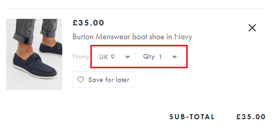
Give your customers the ability to modify their cart selections. Customers may have clicked “Add to Basket” more than once and wish to remove items from their checkout. They might also decide that they want to buy more than one of a particular item, so this is an opportunity for you to maximize your revenue.
Customers may want to remove an item altogether from their basket. Offering this as an option isn’t a bad thing; it’s much better for a customer to remove one item from a basket and checkout than to abandon the checkout altogether.

Secure website
Make sure that you encrypt your website with an SSL certificate. The last thing a customer wants to see when they’re about to enter their bank details is sign saying “Not Secure” at the top of your page.
If your URL starts with “https” and has the padlock next to it your website is secure. Make sure that every page of your website shows this, especially your checkout.
Secure website:

Insecure website:

Make an effort to reassure potential customers that you’re protecting their personal information. Add a “secure payment” logo to reassure customers that their details are safe.
Don’t ask for too much information
Try not to ask for unnecessary information during the checkout. Name, address, email and bank details are usually the primary information you’ll need to acquire. Evidence suggests that decreasing the options that a customer needs to fill in can increase the chances of conversion.
If a customer has to fill in a really long form listing all their details, the chances are that they’ll look at it and won’t be bothered to fill it in.
Only include the text fields for information that you need. Do you really need their phone number? Some people don’t like it when they have to put their phone number in out of fear for receiving marketing advertising to their phone.
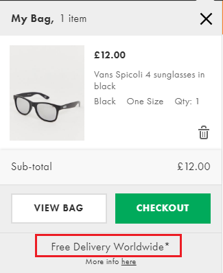
Offer free shipping
Shoppers love to see free shipping options. If you have good value products but have high shipping charges, this can still put off customers, even if they’re still getting a good deal.
If you want customers to fly through the checkout, offering free delivery is a great way to get customers to quickly confirm their purchase. You can even try raising your prices slightly to make up for this and compare your website’s conversions to test which method yields more revenue.

One page checkout
Keeping everything in one page makes the whole checkout process a lot faster because new pages don’t need to load between every stage of the process. This reducing the opportunities the buyer has to leave the checkout without completing a transaction.
With all the information contained within one page, customers can clearly see the stages ahead of them and easily switch back and forth without having to load a new page each time. Most CMSes don’t have a one page checkout as an out-of-the-box functionality, so you will need some bespoke eCommerce web development to implement this.

Offer different payment methods
People prefer to pay via certain payment methods. The more payment options you have available, the more you can satisfy customers by offering their preferred payment method.
Payment is usually the last step in a checkout funnel. The last thing you want is for customers to get all the way to the end of your checkout and leave the cart because you only accept payments via PayPal.
Offer payment by major types of Debit Card, Credit Card, PayPal and eWallets.

Track with a goal funnel
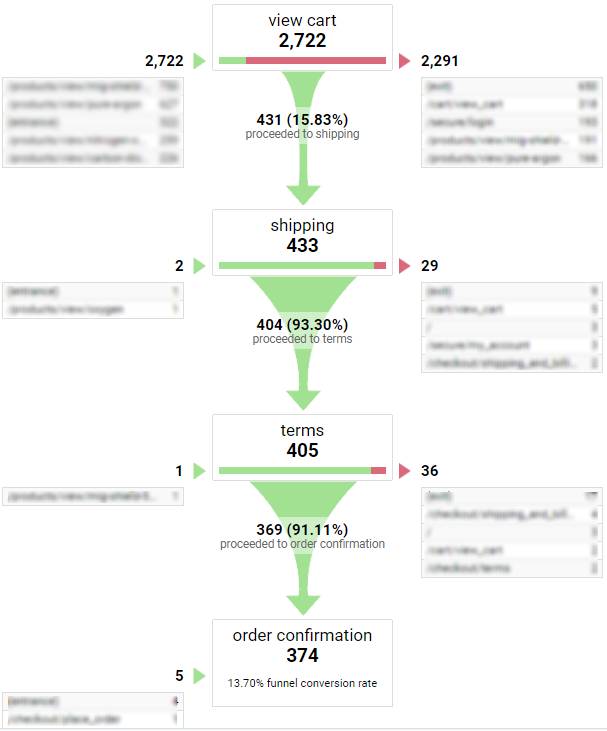
The best way to see the barriers to purchase in your checkout is by setting up a Goal Funnel in Google Analytics.
With a Goal Funnel you can track the flow of users through each stage of the checkout process to see exactly where users abandon the checkout.

In this example, we can clearly see that the primary stage where users are leaving the checkout is in the first stage of the checkout before they progress to shipping. This is the area to be investigated and improved to help increase the percentage of users progressing to the next stage in the funnel.
Guest checkout
Usually when a customer has added an item to their basket and goes to checkout, they will be asked to sign in or register an account. Registering an account may seem like a long process and can put potential customers off making a purchase.
Give users the option of checking out as a guest. The reality is that most users will have to enter pretty much the same information as if they were creating an account. However, they’re more likely to continue the checkout process, where they would have abandoned it before if there was no guest option.
Summary
If you manage an eCommerce website with lots of traffic, small increases in conversion rate can produce huge increases in revenue. Follow these tips to help convert the maximum number of website visitors into paying customers. Finally, don’t forget to test any major changes with A/B tests and conversion tracking before you publish them!
