Designing a unique and attractive logo for your tech company may sound like a challenge. After all, art and design is not everyone’s cup of tea. However, you can still make the process easier and get more than satisfactory results by understanding the fundamentals of logo design and breaking down the work into small and easily manageable steps. Let’s take a look at them one-by-one:
1. Understanding the brand
Before you get started, you must understand the brand thoroughly. After all, a logo is the essence of its brand, and if you don’t understand the brand properly, you can do a good job at the design.
A brand comprises various elements and you want to start with the name. If it doesn’t sound right or fails to encapsulate what you are going for as a business, then you should change it without a second thought. This is because you can change the logo or tagline down the road, but the brand name stays forever. In fact, choosing a brand name that hurts the business is one of the most common branding mistakes made by marketers.
Other than getting the brand name right, you should also think about your demographic. What kind of feelings do you want to generate in your customers when they see your brand? How does your brand differ from the other hundreds of thousands of tech brands in the industry? By asking yourself questions like these, you can easily create a logo that’s spot-on.
2. Starting with the basics

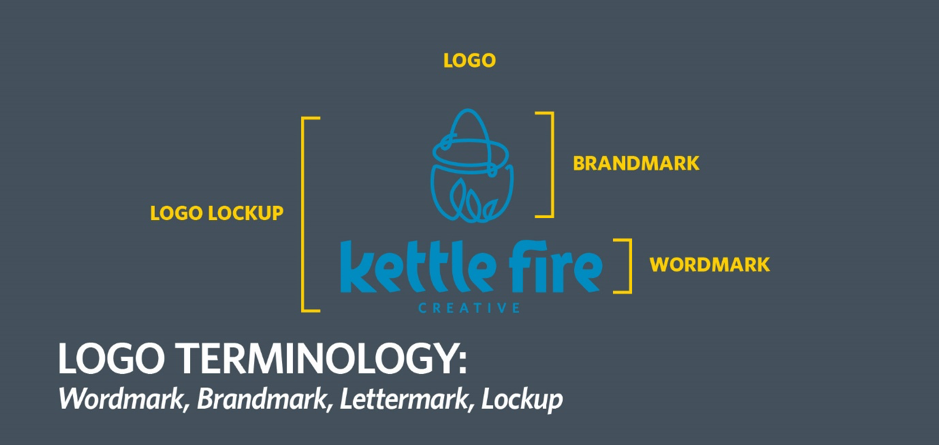
There are many different kinds of logos that you can create. These are:
- Brandmark: These logos are based on icons or symbols that are unique and yet fitting with the brand’s values and mission statement. Examples include Apple, NVidia, etc.
- Wordmark: A wordmark logo is based on the brand name itself. Some good examples in the tech industry that you can consider include Google, Nintendo, etc.
- Lettermark: If a company has a long name, then it doesn’t make sense to use the full name as the brand name. Thus, many companies use the initials instead. IBM, WB, and HP are some of the best examples that use this type of logo.
3. Fonts
Now that your foundation is ready, you can get started with some actual design-work. First comes fonts or typefaces.
You may have a reason to think that the choice of font can’t possibly make a big difference, but you will be surprised to see that nothing could be further from the truth. Fonts play a huge role in a logo especially if it’s a lettermark logo or wordmark logo. In fact, one of the reasons why some fonts cost thousands of dollars is just because of branding. Think about some of the iconic brands in the IT industry- IBM, Microsoft, Google, and Dell. They are also easily recognizable because of their unique typefaces.
If you want your logo to stand out, then you should pick a font that’s either unique or a standard font used in a creative way. Since fonts have emotional attributes too (Archer for playful, Adobe Garamond Pro for classic, etc.), you want a font that sends across the right message.
4. Colors

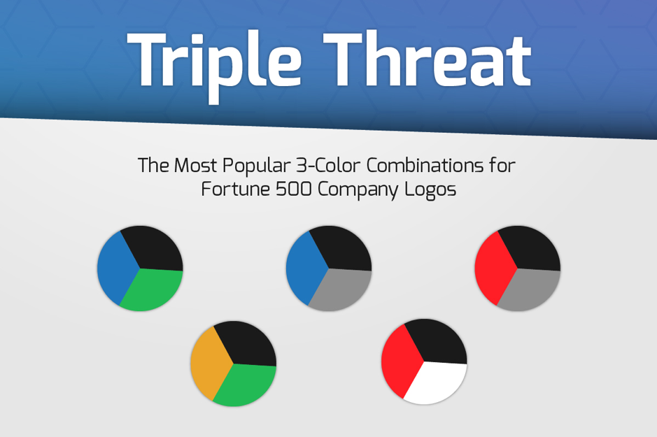
Just like the fonts, you want colors that speak your language. Since the tech industry has a strong affinity for four (4) main colors: blue, white, red, and black, you may pick some of these and add your own twist to the design. Of course, you can also pick a completely different color palette which has maybe tan or yellow, but that wouldn’t be quite fitting for a tech company that wants to establish itself as a trustworthy and top-class brand. This step is actually a lot simpler and easier if you are using a logo make like the Tailor Logo as it picks the best colors for you depending on your requirements. However, if you have decided to take a 100% DIY approach, then you can analyze your brand’s requirements.
Most tech brands want to appear as either of the following- modern, masculine, and luxurious. The best colors for these are as follows:
- Modern: Red, Orange, or Blue
- Masculine: Brown
- Luxurious: Black, Pink, or Purple
5. Icons
Just like any industry, the tech industry has a wide range of symbols and icons that you can use for your logo. All you have to do is pick an image that fits the products or services that you are offering. However, you must avoid the classic mistake of picking something that’s too obvious, plain or unoriginal. Think about all the networking companies that use a web of small dots to represent a “network” or an app development company that has a smartphone in the brandmark. These concepts have been repeated numerous times and they won’t help your brand if you are trying to come off as a disruptive and innovative company.
What you need to do is put on your thinking cap and think out of the box. Ignore the first few ideas that you come up with as they are less likely to be 100% original. Instead, go in the opposite direction and try to connect something that’s not exactly related to your brand but can be somehow linked to it. Think about Apple. When someone thinks about a tech company, then a fruit would be the last thing on their mind, and yet, Apple made it an iconic logo. Think you can do something like that?
6. Bringing it all together
At this point, you have all the ingredients to create a perfect logo for your company. You just need to experiment with different variations until you get your winner. Also, make sure that your logo follows all the 5 principles of logo design so that it has maximum impact. Have fun, and good luck!
