Google Starts Rolling Out Its New Logo and Home Page Design

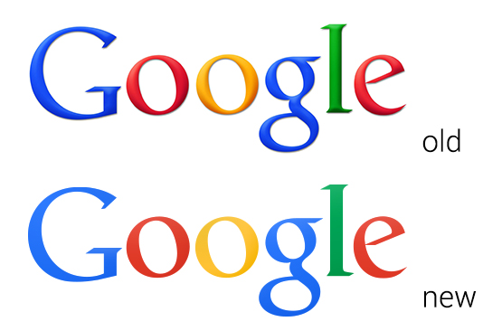
Well, well, well, look what popped up on my Google home page this morning (screenshot below). The brand new Google logo which we wrote about a few days ago, along with a new minimal look-and-feel for the navigation. The new logo sports a flat design with less harsh gradients than the older logo and you know what? I like it.
Funny how they roll out this flat logo design a day after the release of iOS 7. Nonetheless, it’s worth noting that Google could simply be trying a new layout and logo as a trial, the company may very well roll back the changes depending on user feedback. It also appears that not all of the Google services have implemented the new layout yet, just the home page.
Here’s my feedback though: thank you for removing that terrible black bar.