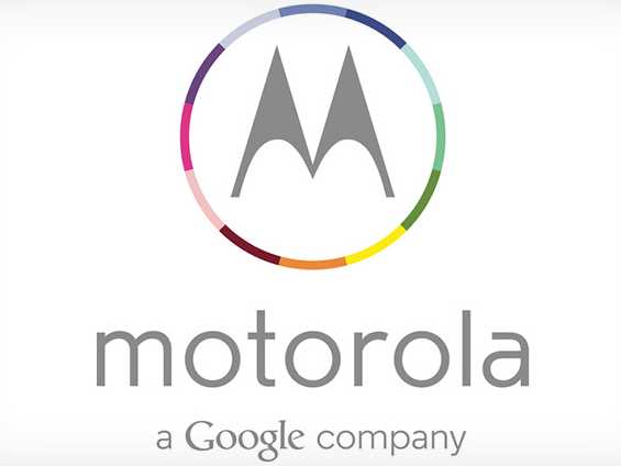
Google redesigns Motorola's iconic logo

Motorola’s logo remains one of the most recognizable branding images in the world, encapsulating the longstanding company’s 85 years of telecommunication devices. Emotions ran high when Google purchased Motorola in May of 2012, with many contemplating the future of one of the few remaining classic American brands. Today, Google announced a big change, redesigning the famous logo to better fit in with the company’s other products while still retaining the classic branding.
The stylized “M” branding remains, now encircled by a vibrant and colorful circle composed of a very obviously Google-inspired color scheme. The classic italic and bold “MOTOROLA” logo has been replaced by a light, airy, lowercase typeface. At the bottom of the logo is a new “A Google company” tagline, Google’s first sign that they’re ready to transform the Motorola brand in Google’s likeness.
With Motorola’s new “Moto X” flagship Android smartphone confirmed to be in development and likely to be the spiritual successor of LG’s Nexus 4 and the first Android device to run Google’s upcoming Android 4.3 operating system, all signs lead to our earlier conclusion – Google and Motorola are declaring war on the mobile industry, and with the entirety of Google fully backing the company, who knows what could happen.