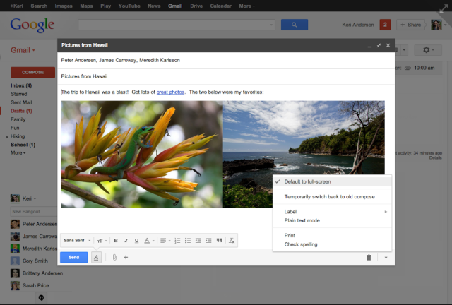
Google offers new, optional full-screen Gmail compose screen

One of the aspects of the Gmail redesign that occurred a few months ago that I personally like least has always been the new compose view, which delegated the compose screen to a relatively small portion of the screen without requiring that you leave the inbox. While this gave the guise of giving you more information while you compose emails, it also hidden a bevy of options that were front and center in past versions of Gmail while also degrading the experience to a more distracting atmosphere then I was previously accustomed.
Fortunately, it appears that other fellow Gmail users have had the same issues with this new view that I have, and Google has just announced that they have implemented a new, optional full-screen compose screen on Gmail, similar to the one Google offered prior to the redesign. Though far from the old compose screen in visuals, this new view gives users an option to see more of their email while they write it while eliminating any distractions that having your inbox in the background caused.
To enable the new full-screen view, simply click the expand button on the top right of the default compose view on Gmail. You can also make this the default view by simple selecting the new “Default to full screen” option that has been added to Gmail’s settings.